
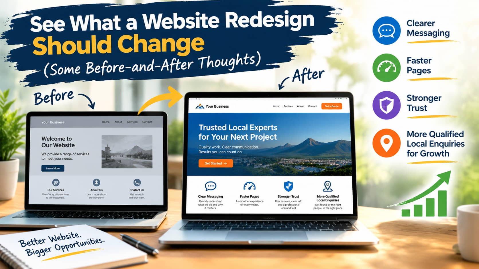
A website redesign before-and-after comparison should show more than a new colour palette and larger photos. For a small business, the real change is whether a visitor can quickly understand what you do, trust you, and take the next step. If the redesigned site looks sharper but still leaves people hunting for services, prices, locations, or a way to get in touch, it has missed the point.
A good redesign turns a website from a digital brochure that exists because it “should” into a working part of your sales process. That might mean more phone calls for a trades business, more quote requests for a consultant, or more bookings for a local clinic. The right result depends on your business, but the website should make that result easier to achieve.
What a Website Redesign Before and After Should Reveal
The most useful before-and-after view starts with the problems behind the old site. Perhaps it was built years ago, loads slowly on mobile, has an outdated logo, or relies on vague language such as “quality service you can trust”. These are common issues, but they affect real customer decisions.
Before a redesign, many websites make visitors do too much work.